Page 26
6.2 Page & Text Contents Tabs
This page covers the first two tabs, from left to right on the interface. Starting with the
page properties, select the Page tab to reveal the editing options.
───────────────────────────────────────
Page Tab
The Page tab contains the basic properties for your web pages, most of which are
common to all of the pages in your website. This is the only tab that is not divided into
Properties & Borders sub-sections. Under the Page tab you can edit only two items:
which elements to make visible on the page, and the page background.
1. Check Item to make visible
You can choose to show or not show any of the elements on your pages, by simply
checking or unchecking the corresponding check boxes - Content (Text Contents),
Masthead, Photo Album, Page Title, Navigation, and Footer. As you check or uncheck
the boxes, you can view each element appear and disappear in the viewer window.
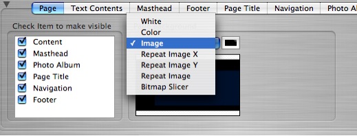
2. Page Background
The page background options let you set the color or use an image for the background
for your pages. You can keep the page background the way it is in the selected theme,
or you can change it to any color you want, or use an image as the background. If you
want to keep the current page background the way it is, don't do anything, just leave it.
To change the background, click on the spin box control to reveal the background
options:
• To apply a White background, select White.
• To apply a colored background, select Color; then click on the color chip to choose a
color from the color palette.
• To use an image for the page background, select Image; locate the desired image
on your computer and drag and drop it into the image well. Note: the color that will
surround the image on the page will be the color selected in the color chip well.
Repeating Images: these options are useful for tiling a graphic across your page to
create a patterned background. Repeat Image X means to tile the same image across
the X axis of your page (horizontally across the page). Repeat Image Y means to tile
the same image across the Y axis of your page (vertically down the page). Repeat
Image means to tile the same image across your entire page, both verically and
horizontally. To repeat an image on your page background, located the desired image
and drag and drop it into the image well. Then select from the repeat image options.
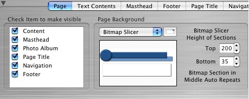
Bitmap Slicer: this option is very useful for adding creative backgrounds to your page
that allow you to easily slice a graphic that you have created in an illustration or
graphics program. Illustrators will find this tool especially helpful. The graphic is
dropped into the well and then sliced up in order to display at the top of the page, the
bottom, and repeat the middle section in the body of the page. To apply the bitmap
slicing, select Bitmap Slicer from the drop down list; then locate the desired graphic on
your computer and drag and drop it into the image well.
───────────────────────────────────────
Text Contents Tab
Click the next tab labeled Text Contents. The Text Contents tab contains the editing
options for the text you input into the description box in the Content editor. You can edit
everything from the size and position of the actual box, to the link colors, font styles,
and borders on the box. Unlike the Page editing options, this tab includes two
subsections: Properties and Borders. By default, the pane will open with the
Properties options selected.
1. Properties Pane
The editing options available from the properties pane, allow you to edit the following
attributes for your text content:
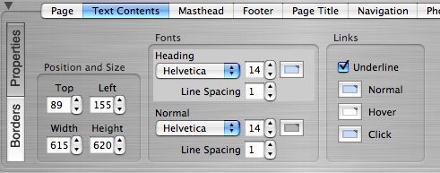
Position and Size of the Text Box
You can position and resize the text box by either using the spinbox controls or by
using your mouse in the viewer window. To move and resize using the spin box
controls simply adjust the Top and Left values to move it, and adjust the Width and
Height values to resize it. To move the box using your mouse, select the box in the
viewer window with your mouse and drag and drop it to the new position. Select the
grab handles with your mouse to resize the box in the viewer window.
Edit the Line Spacing and the Fonts used in your Text Contents
The Fonts section lets you easily edit the font type, size, and color for both the
headings and the normal text in your text description. Simply use the spin box controls
to choose from the drop down list of font types, to increase or decrease the font size,
and click the color wells to change the font color. The line spacing, or line leading, can
also be increased or decreased for both the heading text and normal text.
Edit the Link Colors and Add an Underline to Linked Text
The Links section lets you select the colors for the different states of linked text. You
can make the linked text be distinct or stand out from the normal text or underline it by
checking the Underline check box. The Normal color is the color of the linked text in its
normal state or its regular state. The Hover color is the color that will display on the
text when someone rolls their mouse over it. The Click color is the color that will
display when the linked text is clicked with the mouse. Setting the color for a previously
visited link is not an option in ShutterBug.
2. Borders Pane
Click the Borders button, to reveal further properties for your Text Content. Under the
Borders pane, you can specify the following settings for the text box:
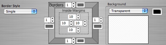
Add a Border to the Text Contents Box
The Border Style refers to the type of border that frames the text contents box. Select
the spin box control to reveal the drop down list of styles. You can choose from Single,
Double, Dotted, Dashed, Grooved, or Ridged border. In order for the border to display,
make sure the Border size settings are not set to '0' (discussed next).
Select the Border Size and Colors
The Borders settings let you increase or decrease the width of the borders by clicking
the spin box controls to set the desired width value. Each side of the border, left, right,
top, and bottom, have to be set individually, and do not have to be the same value.
Likewise, each border side has a color well. Click the color well to change the color of
each border side. As with the size, the colors don't have to be the same color either. If
you do not want any borders around your text box, set all the border values to '0'.
Set the Inside Margins to Help Space the Text Inside the Text Box
The Inside Margins settings allow you to choose the margins for your text description,
similar to that of a word processor when setting the left, right, top, and bottom margins
of your document. The inside margins in ShutterBug serve the same purpose in
allowing you to space text nicely within a framed text box or to align it with other
objects. Click the spin box controls on each side to increase or decrease the margins.
You will see the text move as you adjust these values.
Give the Text Box a Background Color or Background Image
The Background settings let you change the color or add an image for the background
of the text box. This is independent from the background of the page or any other
object on the page. The Background settings let you choose from Transparent, Color,
Image, or Repeating the Image. To keep the background the same color as your Page
background, select Transparent. To select a different color for the background, select
Color from the list, and click on the color well to choose the desired color.
To insert an image into the background, select Image and then drag and drop an
image into the image well. You can choose to repeat the image horizontally across the
X-axis of the text box or conversely across the Y-axis of the box. Or you can make it
repeat across the entire area of the box. If you use an image, be sure to check the
color well, to select the desired color surrounding the image. Whatever color is set in
the color well is the color that will display underneath the image.
───────────────────────────────────────