Page 28
6.4 The Navigation Tab
The navigation tab contains a variety of editing options that let you keep it simple or
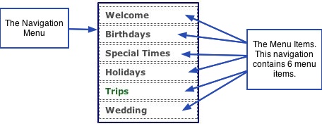
allow you to get a little fancier. There are two elements encompassed in your
navigation: the navigation menu, and the menu items contained inside the menu. The
menu items are the pages in your website, or the names of the pages that you
assigned in your navigation list while in the Content window.
───────────────────────────────────────
Properties Pane
Under the Properties pane of the Navigation tab, you can change and edit the following
attributes:
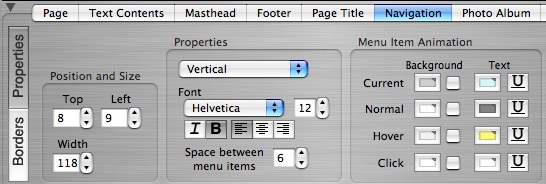
Position and Size of the Navigation Menu
You can either use your mouse to grab the navigation menu in the viewer window or
use the spin box controls to move the navigation menu to a new position on the page
and resize the navigation menu box. You cannot grab the individual menu items for
sizing and positioning as their attributes are relative to the encompassing menu box.
The menu items positioning within the navigation box is set by other properties
covered in the sections that follow here.
Properties: Orientation & Font
Orientation of the Navigation Menu
The Properties section contains a drop down list that lets you choose between
Horizontal and Vertical orientation for your navigation menu. Click the spin box control
and select the desired option from the list. Horizontal will make your menu go across
the page from left to right; Vertical will make your menu go down the page from top to
bottom. Different pages can have different orientations by first checking off the
Customize this page checkbox and then changing the navigation orientation. More on
customization is contained in the next chapter - Customizing Pages.
Edit the Menu Font and Adjust the Spacing between each Menu Item
The Properties section also contains the options for editing the font used in the
navigation menu items. Click the spin box controls to change the font type and font
size (font colors are edited in the next section). Click the corresponding icon to italicize
or bold the font, or to left, center, or right align the navigation text within the menu.
Below these options, is a box to adjust the space between each menu item. Use the
spin box control to increase or decrease the amount of space between the menu
items.
Menu Item Animation: Create the Rollovers and Other Traits for Your Navigation
The third section on the interface, called Menu Item Animation contains the options for
adding different behaviors for your menu items when someone rolls over or clicks an
item. Think of these traits as the different "states" a menu item can be in at a given
time or the visual queues for your visitors. There are four behaviors you can edit and
create:
Current: Current is the current state of the item when someone is currently viewing
the contents of that particular item. Or in other words, the current page being viewed
is reflected or distinguished in the navigation menu by the traits you give it in order to
show the viewer what page he/she is currently viewing. Giving the current item a
different look will make it stand out from the other menu items.
Normal: Normal is the regular state of the menu items when no action is being
performed on them, or rather, while they are idle. The traits you specify for the normal
state is what will be reflected on the items when they are not touched or left alone.
Hover: Hover, also known as a rollover, is the state the item will be in when someone
rolls their mouse over the item or hovers above the item before clicking it. Hover traits
are used to make the item pop out from the Normal state, showing the item contains a
link, as well as creating an interesting visual effect
Click: Click is the state an item changes to when someone clicks on it with their
mouse. The click color or behavior is sometimes set to the same as the hover color,
sometimes the same as the current color, or completely different from the other three
states. These are all a matter of personal preference.
Creating & Editing the Menu Item Animation States: All four states, current,
normal, hover, click, contain the same options: Background color, text color, and an
underline option. The background color is the color that will show up behind the menu
item text. The size of the items' background depends on your margin settings
(covered below under the "Borders" section).
• To give a state(s) a colored background, click the color chip well beside the
corresponding state and select the desired color from the color palette.
• To apply the color to your menu item, click the checkbox.To remove the color, click
the checkbox again to uncheck it.
• To make the font color of the item change with the different states, click the color
wells under the Text heading and select the desired color for each state.
• To have an item underlined during a different state, click the Underline icon beside
the corresponding state.
Navigation for Pages in Group
You can choose to have album pages in a group show up in your navigation menu.
Showing the pages in a group simply allows users to provide another way for visitors to
navigate through a Group without having to go back to the group page each time to
select the next album. Doing this means the rest of the items will disappear from the
menu when someone is visiting the album pages in a group, displaying only the group
page plus the albums in that group. When clicking back to the main group page, the
rest of the main navigation will show up again, while the group album pages will
disappear from the menu.
To show the album pages of a group in the navigation menu, select Pages in Group
under the Navigation shows: heading. Make sure these pages are already set to
"Show" in your navigation options of the content editor, otherwise they will not show up.
Alternatively, to have the navigation display as normal while visiting album pages in a
group, select the Top Level Pages option. As an example, this manual uses the Pages
in Group option for all group pages. You can see in the navigation to the left, that only
the pages for this chapter are showing. If you click on the chapter heading, 6. Create
Your Own Design, you will be returned back to the main
navigation.
───────────────────────────────────────
Borders Pane
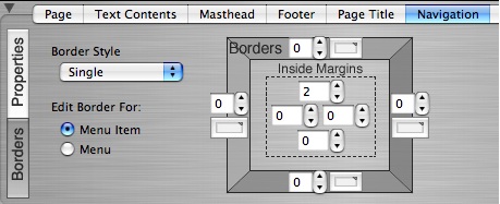
Click the Borders button to reveal more editing options for your navigation menu. The
borders button contains options for both the Menu Items and the main navigation
Menu. These options are the same with one exception: the Menu contains the option
to set the background color or an image background. Whereas the Menu Item options
do not contain this feature. The reason for this is because the background options for
the menu items are already contained under the Menu Item Animation section of the
Properties pane.
Menu Item Editing Options
Click the Menu Item button to reveal the available options. The options here work the
same way as the Border options previously described in the Text Contents section. To
recap how to use borders, margins, and backgrounds, please go to the text contents
section. However, there are some important points to keep in mind when editing the
inside margins of the menu items:
• The menu items are separate elements from the navigation menu. Anything you do
to the menu items will not be applied to the actual menu.
• If you chose to use a background color in any of your menu item animation states
(while under the Properties pane of the navigation tab), that color will fill the area that
the inside margins are set to.
• The margin values for the menu items get added to the margin values of the
navigation menu. If you notice you are getting too much space around the menu
items, check the margin settings for both the menu item and the menu.
Navigation Menu Editing Options:
Click the Menu button to reveal the available options for the borders, margins, and
background of your navigation menu. These options are exactly the same as they are
for the other elements and work the same way. To review how to use the border tools,
please see the Text Contents section. Again, any margin settings that you specify for
the Menu, will accumulate or be added onto the margin values of the menu items.
───────────────────────────────────────